Dev Update: All Aboard!


It’s been yet another impressive month in what I’ve informally been calling this phase of Pluto’s development “Journey to Liftoff” (though you won’t hear anyone else use it officially, it’s just my fun way of tracking time). And perhaps more than any update I’ve provided in the past, I’m ecstatic for two reasons. One, the progress made was so immediately and viscerally apparent to myself and others that I found myself at a loss for words, and two, we have new data that gives an insight into just how big of an impact our progress has made to user retention and enjoyment.
New Beginnings, Literally
I am proud to present to you…. our new onboarding process! Anyone can tell you just how important first impressions are, but perhaps being shown a good example is even more powerful. In previous versions of Pluto, our focus had purely been on the functionality of our various features, taking care to craft a clean and intuitive UI that our users can take full advantage of with minimal headache. However, function without form lacks in touch and grace, and our previous onboarding process, if you could call it that, was emblematic of the piecemeal nature that apps tend to take shape in. Once you created your account, the app was laid bare to you, without the guiding hand anyone but the most professional users would come to expect.
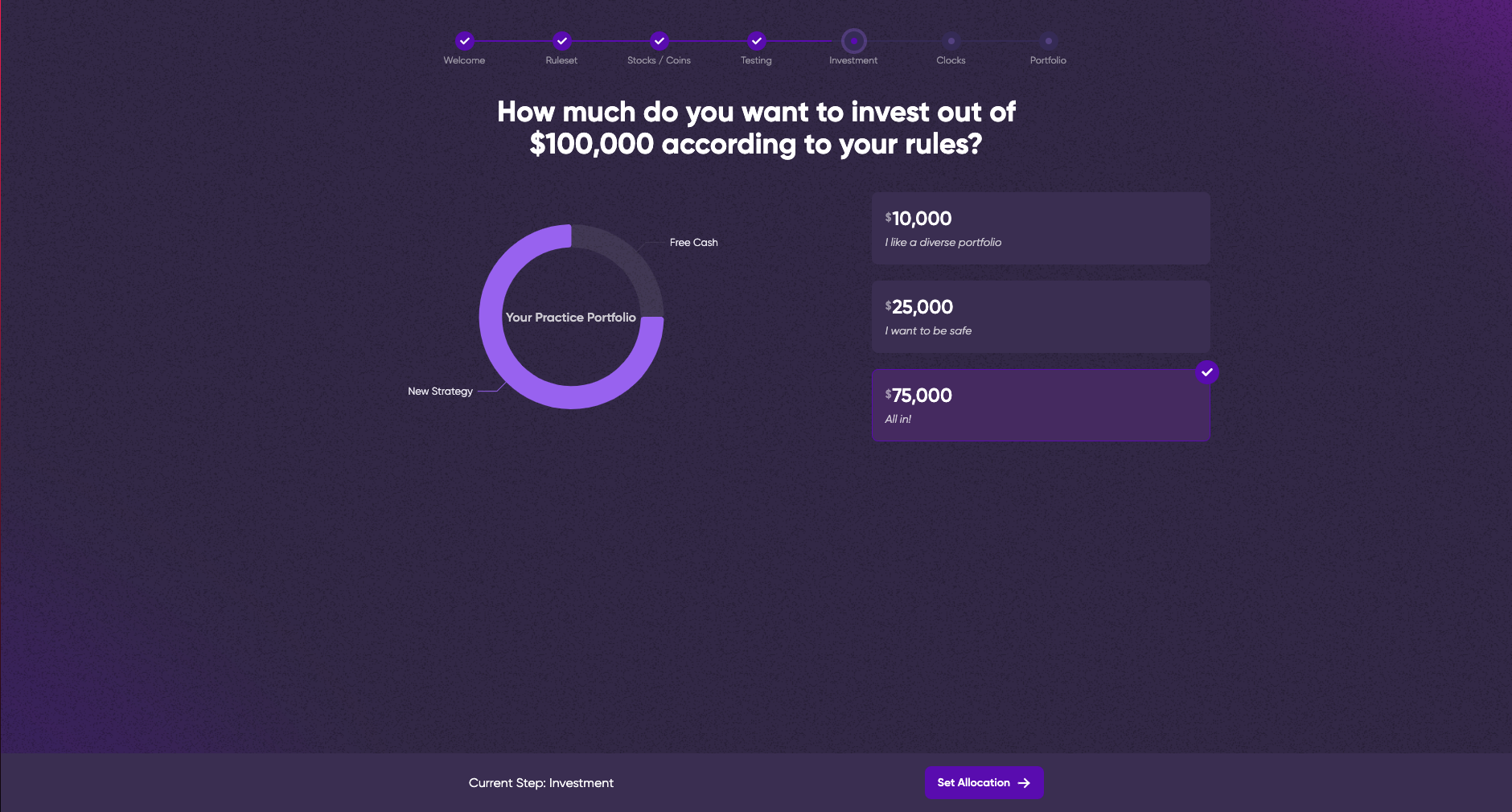
So it’s safe to say that we were in dire need of a rethink. What did we come up with? Take a look.
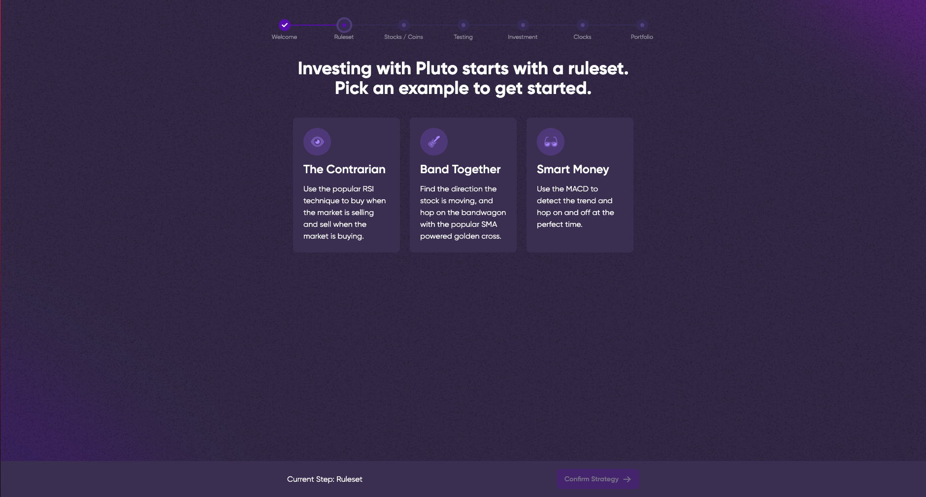
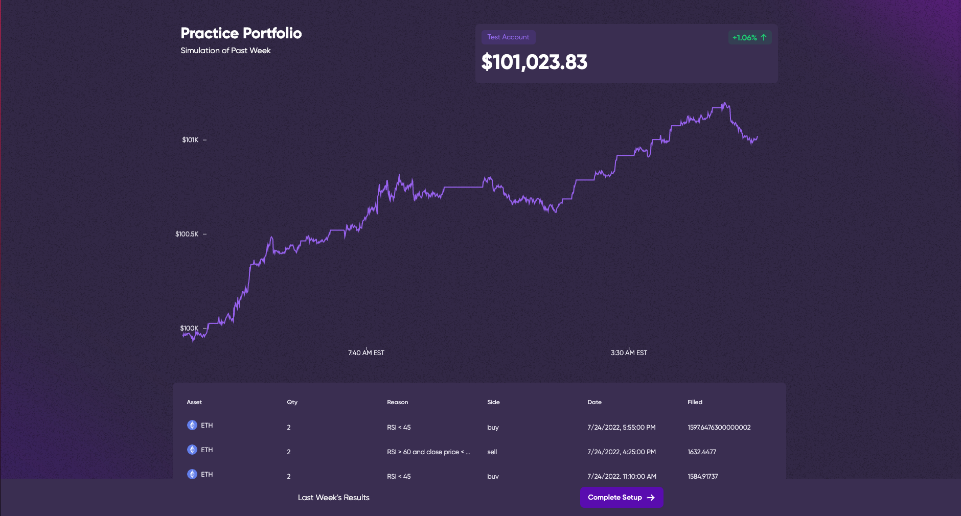
The results of taking our time? A staggeringly quick, deeply intuitive, and downright friendly first brush with Pluto. Rather than being dropped into Pluto all alone, when an account is first created, you’ll immediately be greeted with an interactive virtual tour for every core feature Pluto yet has. From rules, to strategies, to backtests and profiles, and with all the common language used from here and beyond, our users are greeted to an amateur financier’s “hello world,” if you will.
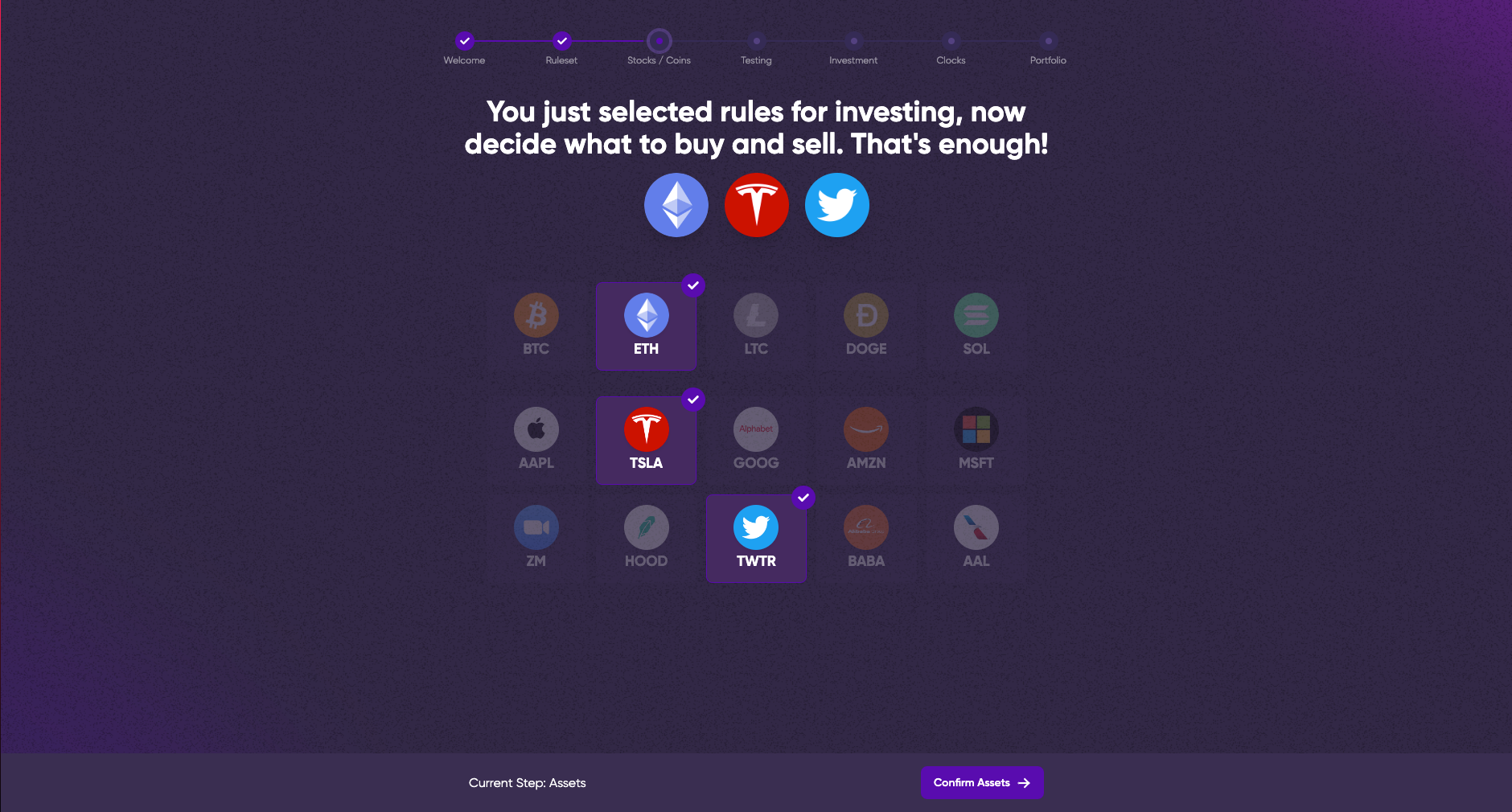
One of the keys to our onboarding process was to ensure that any given user didn’t feel as though there were training wheels, or in a sense, an undue restriction to the practice area that wouldn’t represent our product in its entirety. A lesser user experience would belabor each and every point and click, enforcing muscle memory by blacking out certain buttons and sanitizing the results you can see from the start. Not us. From the start, users will approach these test benches as they will every other going forward, and with verbal guidance and very minimal trial and error discover what does what. For all intents and purposes, Pluto just goes miniature. The compartmentalization of each feature to one full size display window at a time combined with the linear presentation gives users all the runway they’ll need, with nothing they don’t, while still containing all the ways in which users can express themselves in their rules, strategies, and portfolios.

Another key to our onboarding was the softness of design choices. Any app can deliver on the tools of the trade, but not every app can look and feel the part for new users. If a user can’t look at Pluto and tell what buttons do what and which features serve which purpose, or a newly onboarded person can’t immediately transition into a diverse paper trading portfolio within another hour of active time spent on the app, something’s gone horribly wrong. The numbers on this are beyond encouraging, but this isn’t possible without smart, invisible design choices that take a user’s hand and ease them into the tools. That starts with the clearly labeled clickable areas, the short but distinct descriptions of each action, the artistically sound visualizer, and the progress bar at the top to reinforce progress made.
And finally, there’s the modulation on our end. It’s an open secret that we aren’t at all resting on our laurels when it comes to blockbuster features. Those are all going to need their own segment, and this design has room to comfortably introduce each and every new portion of Pluto without a user skipping a beat. It’s easy for software to become bloated as it ages, which at its most destructive is invisible to experienced users and crippling to new users. The onboarding screen is a clear example of a visual design and developmental flow that keeps the future in mind at all times. If and when changes must be made, the core of the process can remain unchanged and make you wonder if anything changed at all.
The Numbers
The proof is in the pudding for this update. After a week of rolling out this onboarding process to new users, the results are in, and they were eye-popping. In the month leading up to the onboarding implementation, we saw user retention percentages in the single digits, nowhere near the number we wanted to achieve. Perhaps that was to be expected with no process in place, but it was still disappointing. Now, with only our first official pass, we’re seeing user retention an order of magnitude higher in far less time, more than 80%!
And the future looks even stronger. This won’t be the last time our team will create streamlined software experiences meant to guide new users through complicated processes. If anything, this is both our groundbreaking first step and a critical proof of concept.
This wasn’t possible without a very philosophical approach to the development of such a feature. Coinciding with the development of Pluto’s onboarding was the christening of our very own office space, which for a company that started off as a mostly remote ordeal, was a great boon for collaboration and cooperation. All the more fitting that one of the very first true collaborative efforts to take place in our new space would be an equally important first step for all of Pluto’s prospective users.
Cheers for now, and here's to even more incredible updates from the Pluto team in the near future. 👋