Dev Update: Strategy Builder

Before I begin extolling the virtues of some of Pluto's latest changes, I have to ask. Are you subscribed to our YouTube channel? Actually, did you even know we have one? This isn't aimless or shameless promotion, it's a serious question. Because I, in the rush to pick my pen back up, hadn't realized just how much content was getting made right under my nose, let alone how helpful and entertaining it is. In fact, I used some of the videos my dear co-workers made for all of you guys just to help refresh me! Vee's great, Bailey's great, the whole marketing team are great and it's been an absolute delight working with them. I thought I'd just give them their flowers, as their work genuinely helped my own. Go subscribe once you're done reading. 'Kay? 'Kay.
AND WE'RE BACK! Phew, I thought I'd never see you again. Once again, I'm happy to report big changes, all for the better (though that's typically understood without drawing attention to it) that have come to the strategy builder. It's not quite a sequel, not quite a remaster, but there's a whole lot new, so let's call it... The New Strategy Builder!
Nailed it.
Launchpad
It's easy to see right off the bat just how friendly the new UI is compared to the last time I talked about it. There's a whole host of thoughtful changes that have been made. This includes: a retooled color palate and color contrast for text to make sustained periods of activity more pleasing to look at, a wide array of default, space-themed titles that feels specifically designed for someone like me whose sandbox had 27 different "untitled" strategies in my account, an enlarged window for the block editor to put the strategy front and center, and a more comprehensive sidebar for users to get where they need to go in fewer clicks. Shields got moved out of purgatory and right up there with the rest of your strategies, cementing its importance in any savvy user's financial diet. The most intensive decisions, like deleting a strategy, running a years long backtest, or reverting to a prior version of your strategy, have all been moved to the right, away from all the other functions, subtly encouraging deliberation through design. Oh, and to put a strategy out into the wild? We've replaced the save button with the "Deploy" button, which will prompt you to fix any glaring holes you might have with your strategy's function before you make it live. Don't worry, it's basically the same, but it's got quality of life and saves you a click or two down the line. Plus, a whole lot of heartache.
And perhaps the smallest, but most important change for me, tooltips! Yeah yeah, welcome to the age of CSS editors, but seriously. One of the biggest problems of the old strategy builder was information density. What I mean by that is a cavalcade of buttons, gizmos and toolboxes were all given and ready to use, but the learning curve was all wrong. Power users with lots of time on their hands got to know it and use it with great success, but where does that leave the average person who just wants to learn how these tools work to begin with? Buttons lacked labels, buttons that didn't need labels had whole descriptions, it wasn't ideal. It was a great iteration for the time, but it wasn't up to snuff. The standard this team holds itself to says that if something isn't working, it gets changed. No one's too prideful to change a design they previously thought was okay, and so while tooltips might seem like the simplest sort of change, where hovering over a button actually tells you what it does, it's an implementation representative of where we want to be as a product. If it takes even five extra seconds for someone to figure out where their strategy information is, that's not just a minor inconvenience to gloss over and ignore the aggregate lost seconds of a whole future user base. It's a failure we take personally, and fix. And I have the extraordinary privilege of representing a team committed to constant evolution and progress.
Thrusters
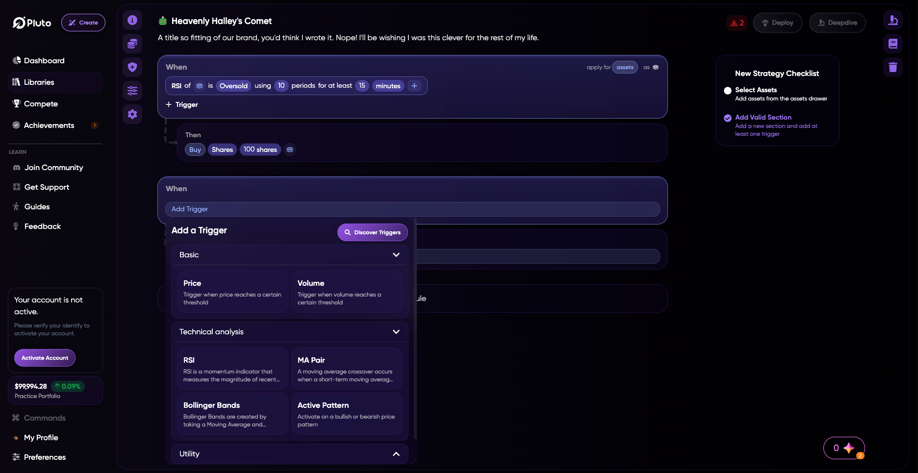
Now that we've gone through some of the more basic changes to layout, aesthetic, and philosophy, let's talk about what powers this whole operation. For the lot of you, this is where the fun begins. The strategy editor taken on the whole spreading its wings, for sure. But if it were just a change to spacing, I wouldn't be talking to you. It would be Jacob, Dakota, or one of the other engineers, firing off a changelog for posterity and calling it a day. This is where the ground starts to shake beneath your feet. Our strategy builder didn't just grow up to meet programmers and hobbyists where they are. With this new approach, we're meeting an entire new addressable market where they're at. Rules and tools are now descriptive, interactive, and friendly. Not following yet? It's probably best I just show you.

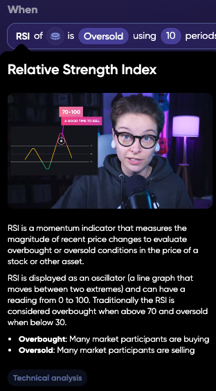
If you're at the stage of... "wait, what's an RSI?" Pluto's coming in to the rescue. With each of our current available rule sets to choose from in the blocks editor, simply hovering over the name of a rule type introduces you to everything you need to know. Confused about what a rule's actually doing to your strategy? Worried about all the different subsets of rules you can choose from? Bad backtesting grades got you down? Since the very beginning, Pluto has tried to give smart, contextually relevant advice on how to create your strategies and automations to the best of our ability. But it wasn't a perfect system back then. If you were returning 20% in a week with your paper trading portfolio, it wasn't so easy to get a read on why that even happened if you were an amateur user. Success and failure wasn't a true point of learning for average users. Trial and error isn't an education if you don't know the why. And that's why this change is so seismic.
Creating a strategy is easier than ever, too. It's not just information about rules. Triggers and conditions got a huge overhaul. You'll find it easy as ever to plug in your information and make changes. Values and units are now an easy point and click, windows are snappy, and the triggers are easy to add and customize. The level of depth and interaction is at an all time high, and never more accessible. Would you rather right dozens of lines of code? The terminal's still right there in the background for you power users. But that power is coming out of the command line and into the hands of novices. And for them? The value of the strategy builder is at an all time high.
Orbit Lock
And all of this is why starting off by plugging the YouTube channel was so important to me. The foundations for a new age financial product that has you thinking about money like this can't be half-baked. It's too important. Members of our Discord, Reddit, and other social media are made up of youthful but well-versed traders with a solid grasp of automation. After all, they found us, and that's our whole bag. We're a tech and finance startup, that's just predictable demographics at play. And they've all loved Pluto for a while now. Trust me, we love them back. We're nothing without our users. But I'd be willing to bet they know a fair bit more about the comings and goings of finance than the average person, and that gap in information shouldn't be the reason someone turns away from the power to manage their money and learn the market's ins and outs. Terminology shouldn't be out of reach. Technology shouldn't be locked away. Pluto's got every intention to change the dynamic of finance forever, and I'm ready to call this one small step. 👋